Transiciones de fotos a pantalla completa HTML + CSS con modernizr
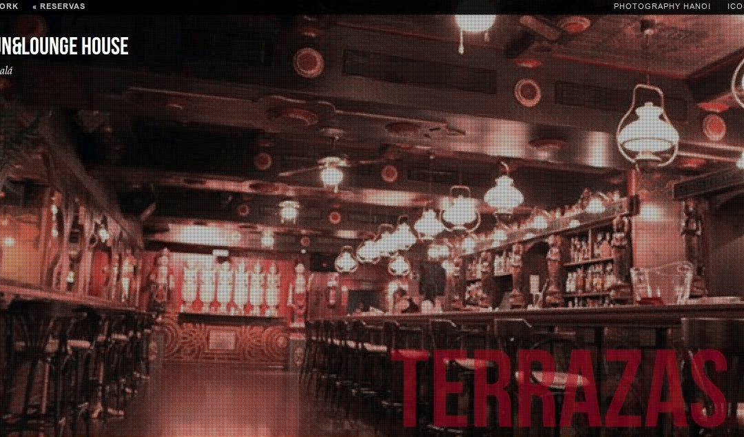
Hoy os voy a explicar un proyecto que preparé hace un año y medio como presentación para Hanoi House y La Terraza del Mercado.
Se trata de un sistema de transiciones fluidas realizado con una librería javascript llamada modernizr. Esta librería te permite visualiza a pantalla completa un conjunto de fotos añadiendo un ligero movimiento y una matriz de modo tal que parece un vídeo grabado.
Si queréis ver el resultado final antes de pasar al código, tenéis aquí un ejemplo: PULSA PARA VER
Vamos con el index.html
El código de ejemplo que os propongo es el siguiente:
<!DOCTYPE html> <!--[if lt IE 7 ]> <html lang="en"> <![endif]--> <!--[if IE 7 ]> <html lang="en"> <![endif]--> <!--[if IE 8 ]> <html lang="en"> <![endif]--> <!--[if IE 9 ]> <html lang="en"> <![endif]--> <!--[if gt IE 9]><!--><html lang="en"><!--<![endif]--> <head> <meta charset="UTF-8" /> <meta http-equiv="X-UA-Compatible" content="IE=edge,chrome=1"> <title>Hanoi Web 916740968 Edición David Casas</title> <meta name="viewport" content="width=device-width, initial-scale=1.0"> <meta name="description" content="Hanoi Fun & Lounge House Bar Alcalá de Henares" /> <meta name="keywords" content="hanoi house, diversion, copas, alcala" /> <meta name="author" content="Codrops" /> <link rel="shortcut icon" href="../favicon.ico"> <link rel="stylesheet" type="text/css" href="css/demo.css" /> <link rel="stylesheet" type="text/css" href="css/style2.css" /> <script type="text/javascript" src="js/modernizr.custom.86080.js"></script> </head> <body id="page"> <ul> <li><span>Image 01</span><div><h3>musica</h3></div></li> <li><span>Image 02</span><div><h3>diversion</h3></div></li> <li><span>Image 03</span><div><h3>relajacion</h3></div></li> <li><span>Image 04</span><div><h3>equilibrio</h3></div></li> <li><span>Image 05</span><div><h3>terrazas</h3></div></li> <li><span>Image 06</span><div><h3>exclusivo</h3></div></li> </ul> <div> <!-- Codrops top bar --> <div> <a href="http://www.hanoihouse.es/"><strong>« VIP Social Network </strong></a> <a href="http://restaurantehanoi.com/hanoihouse/reservas/"><strong>« Reservas</strong></a> <span> <a href="http://restaurantehanoi.com/hanoihouse/galeria-de-fotos/" target="_blank">Photography Hanoi </a> <a href="https://informaticacoslada.com/blog/" target="_blank">ICoslada</a> <a href="http://restaurantehanoi.com/hanoihouse/"><strong>Acceder</strong></a></span> <div></div> </div><!--/ Codrops top bar --> <header> <h1>Hanoi Fun&Lounge House <span></span></h1> <h2>House Bar Alcalá </h2> <p> </p> </header> </div> </body> </html>
Como podéis comprobar, se trata de un index.html muy ligerito que apenas pesa 3Kb, con lo que la carga inicial es muy rápida con cualquier tipo de conexión.
La cabecera
<!DOCTYPE html> <!--[if lt IE 7 ]> <html lang="en"> <![endif]--> <!--[if IE 7 ]> <html lang="en"> <![endif]--> <!--[if IE 8 ]> <html lang="en"> <![endif]--> <!--[if IE 9 ]> <html lang="en"> <![endif]--> <!--[if gt IE 9]><!--><html lang="en"><!--<![endif]--> <head> <meta charset="UTF-8" /> <meta http-equiv="X-UA-Compatible" content="IE=edge,chrome=1"> <title>Hanoi Web 916740968 Edición David Casas</title> <meta name="viewport" content="width=device-width, initial-scale=1.0"> <meta name="description" content="Hanoi Fun & Lounge House Bar Alcalá de Henares" /> <meta name="keywords" content="hanoi house, diversion, copas, alcala" /> <meta name="author" content="Codrops" /> <link rel="shortcut icon" href="../favicon.ico"> <link rel="stylesheet" type="text/css" href="css/demo.css" /> <link rel="stylesheet" type="text/css" href="css/style2.css" /> <script type="text/javascript" src="js/modernizr.custom.86080.js"></script> </head>
Dentro de la cabecera tenemos las sentencias típicas META donde podéis poner lo que os interese. En realidad, la que realmente llama a la librería js es:
<pre><link rel="stylesheet" type="text/css" href="css/demo.css" />
<link rel="stylesheet" type="text/css" href="css/style2.css" />
<script type="text/javascript" src="js/modernizr.custom.86080.js"></script>
Y son importantes las CSS que preparan el entorno con las imágenes que queramos y la matriz que se superpone sobre cada imagen, además del propio movimiento de la «cámara».
style2.css
Esta es la CSS que define, en el caso de la demo, cómo se visualizará el movimiento de las cámaras, qué fotos aparecerán y qué matriz irá sobre la imagen:
.cb-slideshow,
.cb-slideshow:after {
position: fixed;
width: 100%;
height: 100%;
top: 0px;
left: 0px;
z-index: 0;
}
.cb-slideshow:after {
content: '';
background: transparent url(../images/pattern.png) repeat top left;
}
.cb-slideshow li span {
width: 100%;
height: 100%;
position: absolute;
top: 0px;
left: 0px;
color: transparent;
background-size: cover;
background-position: 50% 50%;
background-repeat: none;
opacity: 0;
z-index: 0;
-webkit-backface-visibility: hidden;
-webkit-animation: imageAnimation 36s linear infinite 0s;
-moz-animation: imageAnimation 36s linear infinite 0s;
-o-animation: imageAnimation 36s linear infinite 0s;
-ms-animation: imageAnimation 36s linear infinite 0s;
animation: imageAnimation 36s linear infinite 0s;
}
.cb-slideshow li div {
z-index: 1000;
position: absolute;
bottom: 10px;
left: 0px;
width: 100%;
text-align: right;
opacity: 0;
-webkit-animation: titleAnimation 36s linear infinite 0s;
-moz-animation: titleAnimation 36s linear infinite 0s;
-o-animation: titleAnimation 36s linear infinite 0s;
-ms-animation: titleAnimation 36s linear infinite 0s;
animation: titleAnimation 36s linear infinite 0s;
}
.cb-slideshow li div h3 {
font-family: 'BebasNeueRegular', 'Arial Narrow', Arial, sans-serif;
font-size: 160px;
padding: 0 30px;
line-height: 120px;
color: rgba(169,3,41, 0.8);
}
.cb-slideshow li:nth-child(1) span { background-image: url(../images/6.jpg) }
.cb-slideshow li:nth-child(2) span {
background-image: url(../images/5.jpg);
-webkit-animation-delay: 6s;
-moz-animation-delay: 6s;
-o-animation-delay: 6s;
-ms-animation-delay: 6s;
animation-delay: 6s;
}
.cb-slideshow li:nth-child(3) span {
background-image: url(../images/4.jpg);
-webkit-animation-delay: 12s;
-moz-animation-delay: 12s;
-o-animation-delay: 12s;
-ms-animation-delay: 12s;
animation-delay: 12s;
}
.cb-slideshow li:nth-child(4) span {
background-image: url(../images/3.jpg);
-webkit-animation-delay: 18s;
-moz-animation-delay: 18s;
-o-animation-delay: 18s;
-ms-animation-delay: 18s;
animation-delay: 18s;
}
.cb-slideshow li:nth-child(5) span {
background-image: url(../images/2.jpg);
-webkit-animation-delay: 24s;
-moz-animation-delay: 24s;
-o-animation-delay: 24s;
-ms-animation-delay: 24s;
animation-delay: 24s;
}
.cb-slideshow li:nth-child(6) span {
background-image: url(../images/1.jpg);
-webkit-animation-delay: 30s;
-moz-animation-delay: 30s;
-o-animation-delay: 30s;
-ms-animation-delay: 30s;
animation-delay: 30s;
}
.cb-slideshow li:nth-child(2) div {
-webkit-animation-delay: 6s;
-moz-animation-delay: 6s;
-o-animation-delay: 6s;
-ms-animation-delay: 6s;
animation-delay: 6s;
}
.cb-slideshow li:nth-child(3) div {
-webkit-animation-delay: 12s;
-moz-animation-delay: 12s;
-o-animation-delay: 12s;
-ms-animation-delay: 12s;
animation-delay: 12s;
}
.cb-slideshow li:nth-child(4) div {
-webkit-animation-delay: 18s;
-moz-animation-delay: 18s;
-o-animation-delay: 18s;
-ms-animation-delay: 18s;
animation-delay: 18s;
}
.cb-slideshow li:nth-child(5) div {
-webkit-animation-delay: 24s;
-moz-animation-delay: 24s;
-o-animation-delay: 24s;
-ms-animation-delay: 24s;
animation-delay: 24s;
}
.cb-slideshow li:nth-child(6) div {
-webkit-animation-delay: 30s;
-moz-animation-delay: 30s;
-o-animation-delay: 30s;
-ms-animation-delay: 30s;
animation-delay: 30s;
}
@-webkit-keyframes imageAnimation {
0% {
opacity: 0;
-webkit-animation-timing-function: ease-in;
}
8% {
opacity: 1;
-webkit-transform: scale(1.05);
-webkit-animation-timing-function: ease-out;
}
17% {
opacity: 1;
-webkit-transform: scale(1.1) rotate(3deg);
}
25% {
opacity: 0;
-webkit-transform: scale(1.1) rotate(3deg);
}
100% { opacity: 0 }
}
@-moz-keyframes imageAnimation {
0% {
opacity: 0;
-moz-animation-timing-function: ease-in;
}
8% {
opacity: 1;
-moz-transform: scale(1.05);
-moz-animation-timing-function: ease-out;
}
17% {
opacity: 1;
-moz-transform: scale(1.1) rotate(3deg);
}
25% {
opacity: 0;
-moz-transform: scale(1.1) rotate(3deg);
}
100% { opacity: 0 }
}
@-o-keyframes imageAnimation {
0% {
opacity: 0;
-o-animation-timing-function: ease-in;
}
8% {
opacity: 1;
-o-transform: scale(1.05);
-o-animation-timing-function: ease-out;
}
17% {
opacity: 1;
-o-transform: scale(1.1) rotate(3deg);
}
25% {
opacity: 0;
-o-transform: scale(1.1) rotate(3deg);
}
100% { opacity: 0 }
}
@-ms-keyframes imageAnimation {
0% {
opacity: 0;
-ms-animation-timing-function: ease-in;
}
8% {
opacity: 1;
-ms-transform: scale(1.05);
-ms-animation-timing-function: ease-out;
}
17% {
opacity: 1;
-ms-transform: scale(1.1) rotate(3deg);
}
25% {
opacity: 0;
-ms-transform: scale(1.1) rotate(3deg);
}
100% { opacity: 0 }
}
@keyframes imageAnimation {
0% {
opacity: 0;
animation-timing-function: ease-in;
}
8% {
opacity: 1;
transform: scale(1.05);
animation-timing-function: ease-out;
}
17% {
opacity: 1;
transform: scale(1.1) rotate(3deg);
}
25% {
opacity: 0;
transform: scale(1.1) rotate(3deg);
}
100% { opacity: 0 }
}
@-webkit-keyframes titleAnimation {
0% {
opacity: 0;
-webkit-transform: translateX(200px);
}
8% {
opacity: 1;
-webkit-transform: translateX(0px);
}
17% {
opacity: 1;
-webkit-transform: translateX(0px);
}
19% {
opacity: 0;
-webkit-transform: translateX(-400px);
}
25% { opacity: 0 }
100% { opacity: 0 }
}
@-moz-keyframes titleAnimation {
0% {
opacity: 0;
-moz-transform: translateX(200px);
}
8% {
opacity: 1;
-moz-transform: translateX(0px);
}
17% {
opacity: 1;
-moz-transform: translateX(0px);
}
19% {
opacity: 0;
-moz-transform: translateX(-400px);
}
25% { opacity: 0 }
100% { opacity: 0 }
}
@-o-keyframes titleAnimation {
0% {
opacity: 0;
-o-transform: translateX(200px);
}
8% {
opacity: 1;
-o-transform: translateX(0px);
}
17% {
opacity: 1;
-o-transform: translateX(0px);
}
19% {
opacity: 0;
-o-transform: translateX(-400px);
}
25% { opacity: 0 }
100% { opacity: 0 }
}
@-ms-keyframes titleAnimation {
0% {
opacity: 0;
-ms-transform: translateX(200px);
}
8% {
opacity: 1;
-ms-transform: translateX(0px);
}
17% {
opacity: 1;
-ms-transform: translateX(0px);
}
19% {
opacity: 0;
-ms-transform: translateX(-400px);
}
25% { opacity: 0 }
100% { opacity: 0 }
}
@keyframes titleAnimation {
0% {
opacity: 0;
transform: translateX(200px);
}
8% {
opacity: 1;
transform: translateX(0px);
}
17% {
opacity: 1;
transform: translateX(0px);
}
19% {
opacity: 0;
transform: translateX(-400px);
}
25% { opacity: 0 }
100% { opacity: 0 }
}
/* Show at least something when animations not supported */
.no-cssanimations .cb-slideshow li span{
opacity: 1;
}
@media screen and (max-width: 1140px) {
.cb-slideshow li div h3 { font-size: 100px }
}
@media screen and (max-width: 600px) {
.cb-slideshow li div h3 { font-size: 50px }
}
Estas líneas definen la matriz (pattern) sobre la imagen:
.cb-slideshow:after {
content: '';
background: transparent url(../images/pattern.png) repeat top left;
}
Y las líneas que indican qué fotos de base se insertan y dónde están, además del tiempo de aparición de cada foto. Las cifras que se indican después de las líneas -webkit y -moz son correspondientes al tiempo en el que aparecerá la animación. Así, se marca 6 segundos para la primera, 12s para la segunda y sucesivamente con cada una, de tal modo que puedes elegir cuánto tiempo quieres que dure la animación de cada foto por separado.
.cb-slideshow li:nth-child(1) span { background-image: url(../images/6.jpg) }
.cb-slideshow li:nth-child(2) span {
background-image: url(../images/5.jpg);
-webkit-animation-delay: 6s;
-moz-animation-delay: 6s;
-o-animation-delay: 6s;
-ms-animation-delay: 6s;
animation-delay: 6s;
}
.cb-slideshow li:nth-child(3) span {
background-image: url(../images/4.jpg);
-webkit-animation-delay: 12s;
-moz-animation-delay: 12s;
-o-animation-delay: 12s;
-ms-animation-delay: 12s;
animation-delay: 12s;
}
.cb-slideshow li:nth-child(4) span {
background-image: url(../images/3.jpg);
-webkit-animation-delay: 18s;
-moz-animation-delay: 18s;
-o-animation-delay: 18s;
-ms-animation-delay: 18s;
animation-delay: 18s;
}
.cb-slideshow li:nth-child(5) span {
background-image: url(../images/2.jpg);
-webkit-animation-delay: 24s;
-moz-animation-delay: 24s;
-o-animation-delay: 24s;
-ms-animation-delay: 24s;
animation-delay: 24s;
}
.cb-slideshow li:nth-child(6) span {
background-image: url(../images/1.jpg);
-webkit-animation-delay: 30s;
-moz-animation-delay: 30s;
-o-animation-delay: 30s;
-ms-animation-delay: 30s;
animation-delay: 30s;
}
Os recomiendo que os descarguéis el paquete .zip que he preparado y que contiene todo el sistema y vayáis haciendo pruebas y modificaciones del código. Os pueden quedar animaciones muy interesantes, llamativas y que pesan muy poquito. Además, os servirá para hacer webs en html que quedarán como las dinámicas sin necesidad de andar instalando un script o preparando slides de tipo nivo o similares, que son un poco más complejos que este código que os presento.
El paquete es Creative Commons, podéis usarlo en vuestras creaciones, modificarlo o tomar sólo partes del mismo pero respetando el origen.
Enlace para la descarga del hanoi.zip
Si queréis más info de la librería js, aquí la tenéis: modernizr.custom.86080.js